Showing posts with label Home Values. Show all posts

Sunday, July 5, 2009

“Evidence” on the Foreclosure Crisis

Stan Liebowitz, an economics professor at University of Texas, Dallas, has an op ed piece in the Wall Street Journal touting the results of research he has done using “a huge national database containing millions of individual loans”. His conclusion:

The analysis indicates that, by far, the most important factor related to foreclosures is the extent to which the homeowner now has or ever had positive equity in a home.

My first reaction was, like Barry Ritholtz, “Duh”. If you have equity in your home and can’t pay your mortgage, you sell the home, pay the loan off and pocket the equity. Equity = No Foreclosure.

But, (as Barry also notes), the piece is weird:

A simple statistic can help make the point: although only 12% of homes had negative equity, they comprised 47% of all foreclosures.

Time out; that means 53% of all foreclosures are on homes that have equity. Does that sound right to you?

The accompanying figure shows how important negative equity or a low Loan-To-Value ratio is in explaining foreclosures (homes in foreclosure during December of 2008 generally entered foreclosure in the second half of 2008).

image

I think these are all legitimate contributing factors, but I question some of the conclusions Liebowitz draws. For example:

To be sure, many other variables -- such as FICO scores (a measure of creditworthiness), income levels, unemployment rates and whether the house was purchased for speculation -- are related to foreclosures. But liar loans and loans with initial teaser rates had virtually no impact on foreclosures, in spite of the dubious nature of these financial instruments.

Anyone involved in the crisis can tell you the liar loans and low teaser rate loans were the first to default. You wouldn’t expect to see many of them left by the second half of 2008 (survivorship bias at work).

Also, this a very mixed bag of contributing factors. Negative equity is a factor at the time of default (do I sell the property or allow it to be foreclosed?). A low down payment and a low FICO score are factors at origination. The unemployment increase in 2008 and rate resets happen after origination and before foreclosure. If I’m a low FICO score borrower with a low down payment, a rate reset, no equity, and I lost my job, what caused my foreclosure? Regression analysis can parse out the first four variables if done correctly, but how does the fifth variable enter into the equation? I suspect Liebowitz’s analysis is flawed, especially since he concludes more than half of foreclosed properties have equity.

Hoping for some answers, I checked out Liebowitz’s home page. There’s no reference to this research, and precious little on real estate at all (mostly copyright stuff). If one uses the word “evidence” in one’s title, shouldn’t the evidence be available?

I agree with many of Liebowitz’s conclusions, but it would be nice if they were coherently supported. Also, it’s depressing that some many bloggers have uncritically endorsed the piece without question.

Tuesday, May 5, 2009

Rent or Buy: San Jose or Columbus?

David Leonhardt has an article in The New York Times (hat tip Wehr in the World) about his decision to switch from renting to buying a house. There is an accompanying graphic showing the ratio between the purchase price of a house and the annual rent for an equivalent house by city. I’ve highlighted the ten markets with the highest ratio in green, and the ten markets with the lowest ratio in red:

image

(Click on image for a larger version in a new window)

To me the most interesting thing about this information is the premium people are still willing to pay to own a house in bubble markets. The ten markets with the highest ratios are all California coastal cities, south Florida, and New York and Boston. The cities with the ten lowest ratios are all Midwest cities, plus Pittsburgh, Dallas, and New Orleans.

The city with the highest ratio is San Jose (30.7); the lowest ratio is Columbus, Ohio (11.4). Keep in mind we are not comparing house prices and rents between the two cities, we’re comparing the ratio between house prices and rents within the city. People value ownership in San Jose much more than in Columbus.

There is a long term trend away from the Midwest and to the coasts. The reasons are complex, but boil down to changes in the employment base and geographic attributes of the areas like weather and topography. For more on the employment base issues, a good starting point is Richard Longworth’s Caught in the Middle: America’s Heartland in an Age of Globalization. For more on the role of geographic attributes, see the research of David McGranahan, an economist with the United States Department of Agriculture (summarized in this post).

Monday, May 4, 2009

Fighting Foreclosed Home Blight

Calculated Risk has a post here detailing efforts some cities are making to force lenders to maintain the vacant homes they’ve foreclosed.

Apart from the obvious fact that blight upsets constituents, attacking blight aggressively is good policy because it helps maintain values (and tax bases). I came to this view via Wesley Skogan’s Disorder and Decline and George Kelling’s Fixing Broken Windows, both of which should be required reading for real estate investors, appraisers, and lenders. The latest research provides additional support for the idea that disorder leads more disorder, creating a self-reinforcing downward spiral.

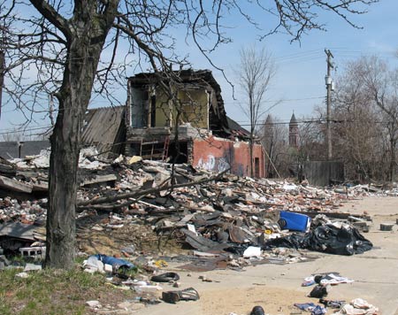
Although Detroit’s economic problems are severe, I wonder if it would have made a difference if funds had been available in the past to keep the place cleaned up.

A city in ruins

Sunday, April 12, 2009

Economic and Real Estate Post Picks: Week of April 6, 2009

Wholesale Sales Up, Inventories Down: Good news on these indicators

Why This Recession is Different: Unlike most recessions, this one is balance sheet driven

Has the Housing Market Bottomed? Builder stocks and the spread between mortgage and treasury yields are both hopeful signs

Why is Consumer Debt Declining So Sharply? An explanation for the sharp decline in credit card debt

Initial Unemployment Claims and the End of Recessions: Does the recent peak in initial unemployment claims signal we are nearing recovery?

Monday, March 16, 2009

A Snake Swallowing Its Own Tail: Mark to Market and Real Estate Values

I’ve previously posted on the illiquidity of the real estate markets and the difficulty and consequences of valuing real estate using distressed sales (see here, here, and here).

Via Newmark's Door, National Review Online has a good summary of the impact of mark to market rules on banks. An excerpt:

Mark-to-market rules damage banks in two ways. The first is that banks have to treat losses on paper as though they were real economic losses, accepting fire-sale valuations of securities that they may not intend to sell. The second is that, because mark-to-market rules are used in assessing banks’ capital requirements, those paper losses can quickly become real losses when banks are forced to sell assets, often at an enormous loss, to raise enough capital to keep the regulators satisfied. Those pressured sales, in addition to locking in losses, tend to drive down the prices of similar assets, creating a vicious cycle of wealth destruction. The market becomes a snake swallowing its own tail.

Wednesday, March 11, 2009

When Real Estate is a Liability

We are used to thinking of real estate as something of value. This is not always the case.

The first appraisal I saw with a negative value was for a 10 story office building in downtown Minneapolis back in the early 1990’s. I couldn’t find any errors in the analysis, but I felt I had to be missing something – a major office building just couldn’t be worthless. I made a trip to Minneapolis to take a look, and it still felt wrong. Sure, it was old (1920’s), but it was by no means falling down, it had tenants, and it was tied in to the skybridge system. It had to be worth something to somebody.

The issues on the building were all the usual suspects – rents and occupancy had fallen, utility costs had increased, and capitalization rates had climbed, all of which combined to hammer the value (I’ve posted here showing how relatively small changes in these variables can  combine to create a 50%+ loss of value). This building had three additional problems; there was major friable asbestos problem that was missed in the initial due diligence, we had not escrowed for real estate taxes and the borrower didn’t pay them (real estate taxes are very high in Minnesota), and there were mandatory fire code upgrades (primarily sprinklers) imposed after the loan closed which had to be completed. The cost of curing these three items exceeded the value of the building. We ended up releasing our debt ($7M) for a $200K payment from the borrower.

This kind of problem is increasingly common. NPR has a story about lenders refusing to complete foreclosures, and there is an abundance of stories on the median home sale price in Detroit (around $7,000, see here and here) and $1 bargains available (see here and here). This 5 bedroom, 3.5 bath home was available for $8,995:

image

And it’s not just Detroit.

The combination of low fundamental values, cost to restore the homes to habitability and cure code violations, and real estate taxes are the reasons these “bargains” exist.

Monday, March 2, 2009

Does the Relationship Between Median Income and Home Values Explain the Housing Bubble?

It’s taken as a given that one of the reasons housing is in crisis is that home value increases have significantly outstripped income growth (see, for example, these posts at The Big Picture, Option Armageddon, and Calculated Risk). Here’s a chart from Calculated Risk showing the relationship over time:

PriceIncomeQ42008

(Click on image for a larger version in a new window)

An excerpt from Option Armageddon explains:

Ask yourself, what is a housing “bubble” and how is one created?  The term “bubble” suggests that prices were, objectively speaking, “too high.”  Clearly this was the case.  A chart of house prices relative to median income makes it abundantly clear.  House prices can’t continue to expand forever, not unless incomes expand at the same time.  If prices are expanding faster than income, then prices are “too high” relative to what people can actually afford to pay for shelter.  In other words, we have a bubble.

This is common sense. But is it true? If it is, you would expect that there would be more foreclosures in markets where the ratio was higher. But that’s not necessarily the case.

Via Creative Class, a study from University of Virginia researchers found:

In San Francisco, for example, median value of owner-occupied housing in 2007 was 9.7 times median family income, yet the foreclosure rate was a mere 0.24 percent. In the District of Columbia, housing values were 6.8 times family income, yet the foreclosure rate was 0.12 percent. And in New York City, housing values were 12.3 times family incomes in Brooklyn (foreclosure rate 0.38), 11.7 times income in Manhattan (foreclosure rate 0.04 percent), and 10.3 times family income in the Bronx (foreclosure rate 0.28 percent). Other central cities lacked such extraordinary house value to income ratios, but in no instance were low foreclosure rates associated with low house value to income ratios (Table 4).

Here’s the table:

image

If the relationship is true, why does San Francisco, which has a value-to-income ratio triple the national average, have a foreclosure rate that is 1/3 the national average?

There is clearly something going on that can’t be expressed in a simple ratio. My suggestion is that bubble markets tend to have relatively low income levels and relatively high concentrations of single family rentals (see this post for a more detailed explanation).

Thursday, February 19, 2009

Best Article Yet on the Residential Housing Collapse

George Packer has written a great article, The Ponzi State, in the February 9 New Yorker (the link is to the abstract but the full article requires a payment if you’re not a New Yorker subscriber). Here is an excerpt:

Driving around Florida’s ghost subdivisions, if feel not just that their influence is waning but that they are physically hollowing out. In a place like Lehigh Acres, near Fort Myers, where half the driveways are sprouting weeds, and where garbage piles up in the bushes along the outer streets, it’s already possible to see the slums of the future. More and more of the residents in Hamilton Park will be renters like Lee Gaither. The vacant houses in Country Walk will be boarded up. The St. Augustine grass in the front yards of Tanglewood Preserve will grow three feet high. The open fields with street lights but no houses will become dumps.

Sunday, February 15, 2009

Underwater Homes, Exurbs, and Income

Paul Kedrosky’s Infectious Greed picks up on a story in the San Diego Union Tribune which has an interesting graphic of the percentage of underwater homes in San Diego County by zip code:

image

(Click on image for a larger version in a new window)

I agree with Paul that the full map tells the story as an exurb phenomenon (I’ve posted on that in more detail here) and relates to vintage (more on that here).

I also think the inset has something interesting to say about household income and underwater homes. The inset area is not an exurb, but there is big variation in the percentage of underwater homes across a relatively small swath of San Diego. Here’s a blowup of a piece of the inset:

image

Best to worst performance is light grey, yellow, orange, red, dark grey.

Now, here’s a UUorld map of average household income (2000) for the same swath:

image

(Click on image for a larger version in a new window)

Note how the higher income neighborhoods have fared better. I’ve written more about that here.

Wednesday, February 11, 2009

Borrower Optimism Bias

Lansner reports on a Zillow survey which finds that, although homeowners are aware home market values have declined, they underestimate the extent the decline applies to their own home:

image

What’s most interesting to me is the future outlook:

Most homeowners seem to believe the worst is over. Seventy percent think their home’s value will either increase or stay the same in the first six months of 2009. Zillow researchers call that “a curious optimism” and say the year will not play out that way.

I’ve previously posted on why borrowers continue to support properties which currently have no equity. I think this “curious optimism” is a big part of the explanation.

Saturday, February 7, 2009

Pittsburgh versus Phoenix, Football and Growth

Although Pittsburgh had the better football team (at least this year), Edward Glaeser picks Phoenix as the long term growth winner:

The Super Bowl was a reversal of fortune because Phoenix is one of the country’s biggest boom cities and Pittsburgh continues to lose population. Since the last census, Phoenix’s population has grown by 927,551, more than any metropolitan area except Atlanta and Dallas. Over that time, the Pittsburgh area has lost more than 75,000 people, more than any city other than Katrina-beset New Orleans.

Why?

The great boom areas of the 21st century — Atlanta, Dallas, Houston and Phoenix — are expanding because of a combination of warmth and willingness to build. While geography made Pittsburgh’s rise inevitable, Phoenix has few innate natural advantages, other than sunshine. Instead, it has mile after mile of desert, which it is covering with thousands of attractive, affordable homes.

Warm temperatures don’t count for everything, for example, Denver and Boise, for example, both have strong long term growth trends and are not particularly warm places. When you account for a few other natural amenities like mountains and water you get a better picture of which areas grow and which don’t. David McGranahan of the U.S. Department of Agriculture has studied the effect of natural amenities on growth for many years. I’ve previously posted on his work here.

Friday, February 6, 2009

Did Homeowners Really Lose $3.3 Trillion in 2009?

Zillow, via The Big Picture, says so:

The U.S. housing market lost $3.3 trillion in value last year and almost one in six owners with mortgages owed more than their homes were worth as the economy went into recession, Zillow.com said.

I have previously posted about how illiquid the residential market is; only about 5% of homes trade in a year. In the current environment, distressed sales are a very significant percentage of the sales occurring. This post says 45% of sales in December were distressed, but I suspect the number of people selling because they have to is much higher than this – why would anyone voluntarily sell in this environment?

So, you take an inactively traded market, base your current value on distressed sales, extrapolate back to the entire market, and report a huge value loss. That approach is one way of looking at things, but the only owners who actually lost money are the 5% of owners who actually traded. Further, the amount they lost is limited to their investment, so a good share of the actual loss was picked up by their lenders (in some cases, all of it; remember those 0% down loans?).

Actual homeowner losses are much, much smaller than this number.

Wednesday, February 4, 2009

Will We have a Commercial Real Estate Crisis?

Casey Mulligan thinks probably not. From his New York Times piece:

For months now, experts have been predicting that commercial real estate will be “the other shoe to drop.” But in fact, non-residential building fell far behind housing construction during the housing boom. This shortage of commercial buildings relative to housing suggests that a commercial real estate crisis will not occur, or that at worst it will occur with much less severity than did the housing crash.

Here is the chart purporting to support this argument:

image

(Click on image for a larger version in a new window)

The error Dr. Mulligan makes is the belief that the housing bubble and future CRE performance was/is primarily a function of inventory. The chart suggests housing prices have collapsed because too many residential structures were built. That’s like saying Citibank’s stock price has collapsed because too many shares have been issued. Home prices have dropped because the financing that people used to buy homes at an inflated price is no longer available, not because there are more homes than people are willing to occupy. To the extent CRE inventories were tight, values were inflated, which won’t help us now if the deals were leveraged based on the higher values.

For example, look at Miami, a residential bubble market. The graph below shows the number residential permits issued in relation to the number of new jobs created on a rolling 12 month basis. The secondary axis is the OFHEO Housing Price Index year over year change.

image

(Click on image for a larger version in a new window)

Home price increases began decelerating in late 2005, but at the time Miami was creating twice as many jobs as new units, so if anything the market was undersupplied. Something else was clearly dragging prices down, and in retrospect we know it was the withdrawal of aggressive lending parameters.

Now, of course, most markets are losing jobs, and most markets are still adding units (and commercial real estate) as projects work there way through the development pipeline. We won’t see a recovery until the employment situation turns around.

What does this mean for CRE? We don’t know for sure how many deals were done with aggressive underwriting during the peak years, but we know there were quite a few and so we can expect some decline in values related to the withdrawal of aggressive leverage similar to what’s happened in the residential market. We also know that CRE is sensitive to employment trends, and those are very negative. The CRE situation may not become as bad as residential, but if it doesn’t it will be because the underwriting was better and employment improves. It won’t be because there was a lack of inventory.

Sunday, February 1, 2009

The Housing Market is not Like the Stock Market

If you own some shares of Microsoft, you won’t have any trouble selling it - on average, more than 80 million shares of Microsoft trade every day the market is open. If you own a home, the situation is completely different.

Here are the Microsoft numbers:

Trading Days in 2008

250

Microsoft Avg Daily Volume (1)

80,406,925

Annual Volume 20,101,731,250
Shares Outstanding

8,895,573,000

Annual Volume/Outstanding Shares

226%

(1) 50 day average as of 1/30/09  

The market for Microsoft stock is thick. The housing market, to understate, is thin. Here are the equivalent numbers:

Existing Single Family Home Sales

4,260,000

Existing Single Family Homes

84,781,485

Sales/Homes

5%

Everyone learns in Investing 101 that thinly traded markets are relatively illiquid. The homes being sold now are overwhelming not voluntary sales. They are being sold out of foreclosure, are forced sales as a consequence of the owners situation, and are new homes working their way through the development pipeline. It is no surprise these homes are subject to dramatic markdowns given the lack of buyers in a market that is thin to begin with.

Fortunately, the vast majority of homeowners do not view their housing investment like a stock; homes are first and foremost places to live. Those unfortunate enough to have to sell in this market or who are overleveraged and can’t service the debt will experience losses. The rest of us are just like long term investors with a dividend stream, but in this case the dividend is living in a home we like paying an amount we can afford.

The sales estimate is from the National Association of Realtors as of December, 2008, and the number of homes is from the Census.

Saturday, January 24, 2009

Foreclosures in the Exurbs

Foreclosures are concentrated in the exurbs. I’ve previously posted here about how this is primarily a vintage problem; in these new developments the houses were sold and financed in a relatively short time frame at the peak of the market using aggressive financing, and hence when the downturn occurred these neighborhoods have been hit in a very concentrated way.

Green Valley Ranch, a development on the outskirts of Denver, is a poster child for this problem. From an April, 2008 USA Today story:

This small corner of the Mile High City represents an extreme example of how foreclosures are transforming lives and neighborhoods. On some blocks, as many as one-third of the residents have lost their homes, making this one of the worst hotspots in a city that was among the first to feel the pinch of the foreclosure crisis. Many houses here remain empty, bank lockboxes on the front doors…

     Many neighborhoods in Denver and across the nation have largely been spared from that tide, but others have been hammered.

     That's especially true here, along the broad avenues of Green Valley Ranch, a remote subdivision of soft-colored houses with red-tile roofs sewn into the vast carpet of flat, open land on the city's eastern edge. As Denver's housing market boomed at the beginning of this decade, the area became a magnet for low- and middle-income families buying their first homes in the kind of brand-new neighborhood they once thought would always be beyond their reach. Some turned to more-expensive subprime loans, which charged higher interest rates to borrowers with bad credit. Others got adjustable-rate mortgages and saw their payments increase sharply after two years.

This is Green Valley Ranch’s location:

image

Here is a map from the USA Today article showing foreclosure activity in the neighborhood between 2006 and 2008:

image

(Click on image for a larger version in a new window)

Note that this is happening in Denver, where home prices have  remained relatively stable (see this post for information on Denver’s performance relative to other markets).

Thursday, January 22, 2009

Why Are the Nation’s Worst Housing Markets in the Exurbs?

Housing Wire has a list of the 20 worst housing markets in the United States, as measured by the percentage of homes which are worth less than their mortgages. Here are Google satellite photos of the worst 4:

#1 Zip 95391, Mountain House, CA. You can read more about this unfortunate place in this New York Times article.

95391

#2 Zip 89166 (Clark County, NV):

89166

#3 Zip 89178 (Clark County, NV):

89178

#4 Zip 95742 (Sacramento County, CA):

95742

See a pattern? All of these are new developments at the outskirts of suburban areas.

There is a theory that the collapse of these nascent communities is attributable to high gas prices (see this post in Econbrowser and this article in Muninet Guide, for example). That might have been a contributing factor, but it’s not the primary problem.

The primary problem is one of vintage. In a developed neighborhood, only a small percentage of homes sell and are refinanced in any given time period. In a new development, everyone buys and finances in a relatively compressed time frame. These communities all hit the market during the peak of the underwriting craziness, so a much higher percentage of homes in these areas ended up overleveraged.

Friday, January 16, 2009

The Lumpiness of Housing Inventory

There is an excellent post on TraderFeed describing variations in housing inventory between markets and price ranges:

Someone recently told me that my own local housing market in Naperville, IL is in relatively good shape because there is only about one year of inventory for sale based on 2008 sales figures. If, however, we break down the inventory by price (see chart above), we again see evidence of lumpiness. There is little inventory problem at the lower end of the housing spectrum; speculation in that market had centered on the luxury end, where there is more than 3 years of inventory. At year end 2008, annual sales of homes above $1,200,000 in Naperville were 36, but 114 homes were on the market. Stated otherwise, about 3% of housing sales in that market have been above $1,200,000, but 15% of the inventory is priced at that level.

I touched on this point in my post suggesting we can't just assume excess inventory is a result of overbuilding, but Brett provides much more detail on the variable mismatch between supply and demand between and within markets.

Monday, January 12, 2009

Low End Housing Gets Hammered in a Recession

Lansner on Real Estate reports the low-end Los Angeles / Orange County home price loss is nearly twice the high end:

image

I’ve posted before on why low end multifamily underperforms in a recession, and I think the same logic holds for single family values. I think this is also consistent with my argument that part of the reason some markets bubbled more than others is the markets had a high percentage of rental single family housing (discussed here). My conjecture is probably much of the low end houses trading now were probably originally rentals that were sold to owners, were foreclosed on, and are now shifting back to rental stock at prices that can be supported by rents.

Saturday, January 10, 2009

Is Overbuilding Responsible for Excess Housing Inventory?

The President of the National Association of Home Builders says “The excess housing inventory in today’s market is the result of unprecedented foreclosures, not overbuilding.” Paul Jackson, Housing Wire, suggests this statement “borders on the certifiably insane ." I may be certifiably insane, but I think the NAHB position is closer to the truth.

Obviously, we have excess inventory. The amount is subject to debate, but arguments Vacant Subdivisioncan be made for between 1.75 to 4 million excess units (see this Calculated Risk post, for example). Obviously, many of the excess homes are newly completed builder inventory. You can read the story behind the pictured subdivision here.  So, in a sense builders are responsible for at least a portion of the excess inventory. They built it, it’s empty, end of story.

But, of course, it’s not that simple. There are a lot of people who are living in substandard housing, in apartments, with their parents, with roommates, etc. who would be delighted to be living in these “excess” units. The problem is much of the excess is located in places people don’t want to live or can’t find jobs (read, for example, these depressing posts about Detroit in The Big Picture and The Weekly Standard). And, much of the excess is not affordable even at today’s depressed prices to the people who want the units.

I think Miami is a good example of what actually occurred. Here is a chart of residential permits issued in Miami between 1999 and November, 2008:

image

(click on images to open larger versions in a new window)

On it’s own, this is about as clear a case as you can get of overbuilding – permits obviously spiked between 2004 and 2006, which nicely dovetails with the peak of the subprime craziness. But, consider employment growth in Miami during the same period:

image

At the same time permits were peaking at around 45K per year, Miami was adding jobs at 100K a year. Can you really say builders were overbuilding when there are twice as many people with new jobs as units being added to supply? If anything, the numbers imply a housing shortage in the peak period. Here is a chart showing the ratio between new jobs and residential permits:

image

From mid-2002 through 2007 Miami was adding more jobs than housing units, and for most of this period it was adding around two jobs for every new housing unit. This was not an overbuilt market during that period.

In contrast, here is an equivalent chart for Houston:

image

Housing prices have held up relatively well in Houston, and most people do not consider it to have been one of the bubble markets. But, note Miami had substantially more jobs added per new unit than Houston did during this period. The data suggest Houston was relatively overbuilt compared to Miami.

In fact, the data suggest that maybe part of the problem in the bubble markets was builders didn’t build fast enough to keep pace with the demand created by new jobs (you can see similar charts for Los Angeles, San Diego, Las Vegas, and many more markets here). I’m not ready to go so far as to suggest they should have done so – had lenders stuck to reasonable underwriting standards more of that demand would have shifted to the rental market and we would have seen higher rents and less vacancy in that segment, which I think we all agree in hindsight would have been better than putting people in houses they couldn’t afford.